Last Updated on March 11, 2023
Author: SAMANTHA DANSBY
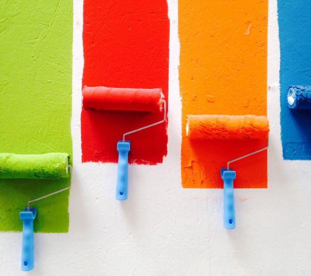
If you have caught the DIY renovation bug, you’ve surely thought about grabbing a paint brush and re-painting a room in your home (or perhaps all of them). Painting is one of the quickest and easiest ways to transform the look of a space from dull and boring (50 shades of beige) to bright and airy, or to update color from an era long gone (peach and sponged!). Most notably, a fresh coat of paint can revitalize dark, dingy walls or cover up imperfections that have happened over time.
The secret, of course, is choosing the right paint color. That’s often the most time-consuming and painful part of the painting process. Could there be more shades of green? Will red be too bold in my home? How do I match my furniture at all times of the day? We all are fearful of choosing the wrong color, even just by a few shades. (alignlife.com) It can completely throw off the flow of your home and your love for the space. So, why not bring some science into your decision?
Color science has long guided product design and, yes, even interior decorating decisions. That’s because certain tones, shades, and hues just go together better. But, before you get overwhelmed, take a deep breath. There are plenty of tricks and tools to help you figure out what will work best in your space. Here are five considerations to help guide your decision so you aren’t lost on the paint aisle.
#1 Think about how you’re using the room
The first design consideration is a big one: how are you planning to use the room that you are re-painting? Our minds already associate different colors with different activities. Bright, bold colors give us energy–perfect for a playroom or home gym. Meanwhile, muted tones help us relax, making them ideal for a bedroom or bathroom turned at-home spa.
#2 Understand how colors make us feel
Here is some information that sprouts from our psychological perception of colors.
- Red grabs our attention. This color has the longest wavelength and, psychologically, we associate it with physicality. Movement, excitement, even aggression. This is a bold statement color and perhaps best left as an accent.
- Blue makes us think. It often is associated with a sense of calmness and can provoke thought, reflection, and intellect. However, it can be cold and unfriendly.
- Yellow is an emotional color. Psychologically, yellow is considered the strongest color. It’s often tied to friendly and creative activities, and would work great in a craft room or reading nook.
- Green is considered the color of balance. After all, we see it everywhere in nature. It’s refreshing and often tied to restoration and peace. It could be boring in the wrong design scheme, though.
- Violet is often seen as a spiritual color. It can evoke a sense of relaxation, luxuriousness, and truth. It’s often styled as a romantic color and also used in modern bathrooms.
- Orange is a fun, passionate color. Bright yet warm, this is a popular color for rooms where you want to kick back and just hang out with friends or family. Think game rooms and recreational areas.
- Grey is psychological neutral. Too much can make a room feel dingy or bland, so it’s important that you complement it with the right accent colors.
- Black is the color of sophistication. It represents security, glamour, and even mystery. However, it can seem cold when used by itself or used too much.
#3 Look at the natural lighting
The natural lighting of a room will definitely help you determine the right paint color. If the room has a lot of windows, you might be able to get away with a deeper color. However, if it does not get a lot of natural light (or if it won’t during the main hours of the day when you plan to use it), you might opt for a lighter tone. For instance, your dining room may have a lot of windows, but will the sun usually be up when you’re eating dinner or having a formal party?
You can also take unnatural lighting into account, but realize that this lighting doesn’t have the same impact on paint color as natural light does. It’s best to hold up a paint chip during the time of day you will most likely be using the space and also at the time when natural light is at its best. This will help you see the truest representation of the color.
#4 Consider the furniture
It’s harder to choose a paint color for an empty room with no furniture in it. That’s because, once you add the furniture down the road, the paint color you picked out may not perfectly complement it. This gives you two options: use the furniture to help you pick out the paint chip or use your paint chip to help you pick out furniture. Regardless of which way you choose to go, the room has to work together as a whole so you must take it all into consideration.
If you’re working with professional interior painting services, they can give you some pointers on what paint color will work best. They’ll also help you see the room in the context of your home, especially if the space connects to or flows through the main part of the home.
#5 Narrow down your choices
Bring any fabric samples with you to the store, then narrow down your choices by grabbing the paint chips that catch your eye. Keep it simple – try not to get more than 5 variations of the same color and pick only colors that match the activity and light in the room. Bring your samples home and check them against the wall at different times of the day. That Stonewashed Gold that was so beautiful in the store may look like the color of a Band-Aid on your walls.
The process doesn’t have to be that difficult if you take your time, consider the tone you would like to create, match the design elements already in place, and take samples home. You’ll surely choose the perfect color, and chances are, it will be 50 shades of beautiful.


