Last Updated on December 23, 2023
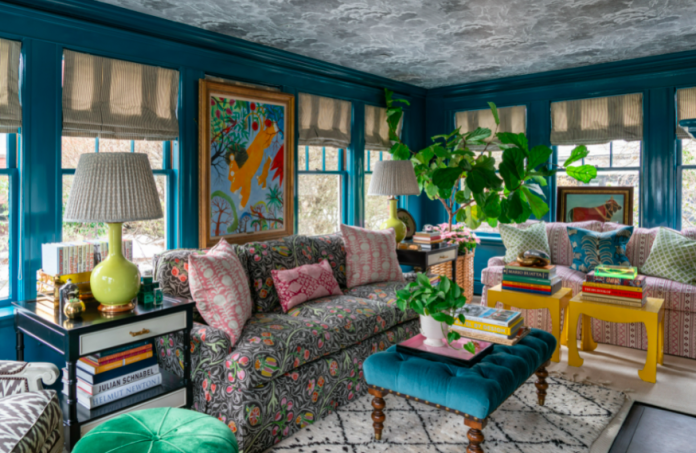
Mixing and matching patterns is fun to add character and elevate your home decor. Start with a color scheme and let it guide you in picking patterns that complement each other.
Using patterns in decorating can be tricky, but it’s easier than you think.
Table of Contents
Color
Mixing patterns can feel so daunting that many people leave the job to design professionals. But with the right tips and tricks, it’s much easier than you might think.
The key is to begin with a color palette you adore and work your way up. Then, choose a pattern that complements those colors and incorporate it into other patterns. Suppose the different patterns all include the same primary color (such as blue) or a similar secondary hue (like the leaf green from a floral). In that case, it’ll help ensure the prints coordinate rather than clash, making your room feel curated and stylish.
Another essential factor to consider is pattern size. Large-scale patterns can be overwhelming for a room, so balance them with smaller patterns or solids in coordinating colors. For example, if you’re going with a herringbone wallpaper on one wall, opt for a striped headboard and polka dot pillows to tone it down.
Scale
When selecting how to mix patterns, it’s critical to consider their magnitude. Larger patterns should be paired with smaller ones to create balance and avoid visual overload. Think small gingham stripes paired with jumbo florals or ikat prints with polka dots. This isn’t to say you can’t use bolder patterns — just be sure that neutral-coloured elements surround them.
Another critical point to remember when mixing patterns is that it can help group them by style. Traditional patterns combine more easily with other prints, whereas plaids and damasks might not blend well with chevrons or ikats.
These rules can make it easier to be adventurous when choosing patterned home decor pieces for your space at a quality furniture store in Ottawa – transform your space with elegant designs. Finally, beauty is in the eye of the beholder, so don’t be scared to deviate from the norm if you like the look! Just remember to take it slowly and always test out the combinations in your home.
Texture
Mixing patterns and textures can seem intimidating, but with the proper knowledge and experimentation, it is easy to achieve a design that looks like a professional designer planned.
The most crucial tip when mixing patterns is finding a common element that ties them together. Choose a color scheme and work within that to find coordinating fabrics. This way, you can avoid overwhelming the eye with contrasting patterns that don’t blend well. This could be a specific color that appears in each pattern or the pattern’s scale. This could be a line, a chevron, or even the direction of the pattern. Keep in mind that odd numbers of patterns tend to look best.
Size
Pattern mixing can be intimidating, especially if you’re a design traditionalist or watch too many home television show reruns. But it can be done beautifully and cohesively when you follow some basic rules.
One key to coordinating patterns is using varying scales. The larger pattern should represent the anchor and be used on large surfaces like walls, area rugs, or window treatments. A medium-sized pattern should be reserved for furniture, and a small pattern should be used for accent pillows or throw blankets.
Color can also help unify a mix of patterns. For example, a blue floral and yellow geometric could work well together if the flowers are in darker tones and the geometric has softer shades.
Another good way to build your pattern mix is to start with a large-scale pattern, then pick a medium-sized pattern that incorporates all of the colors in your color scheme, and lastly, a smaller pattern that uses just two or three colors.


