Last Updated on February 27, 2023
If a soon-to-be vacation goer finds your tourism business for the first time, enters your website, and is bombarded with pop-ups and useless links, what do you think they’re going to do next? It’s simple. They’ll leave your website and go somewhere else. 94% of first impressions relate to your site’s web design; if it’s not eye-catching and user-friendly, people aren’t going to come back.
Websites have become an important marketing channel, and businesses need to make every possible effort to ensure their website is functional, attractive, and responsive. If you have no idea where to start or how to elevate your tourism website design, here’s what you need to know.
Below are some key components you can use to improve your tourism website design and impress your visitors.
Table of Contents
Best Tourism Website Design Ideas
Add High-Quality Images
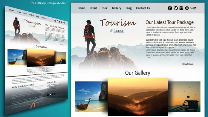
One of the best design ideas for tourism websites is to use high-quality and authentic images. Businesses often make the mistake of using stock imagery on their websites. While there’s nothing wrong with that at first glance, you must remember that other websites will also be using the same images (they’re free, after all).
To stand out from the crowd, use original, high-quality photography. For instance, tourism websites can add pictures of locations, activities, living quarters, etc. Your images should display real-life scenarios that your audience can relate to.
Implement Call-To-Actions (CTAs)
Another way to improve the design of your tourism website involves creating clear and strong call-to-actions. You want visitors to take these actions when they enter your website and are ready to purchase. Since nobody likes spending money, you need to entice them to move further in the sales funnel by creating bold, fun, and prominent CTAs in the form of a button, link, or pop-up.
Make sure the CTA is short, bold, and in colors that are not used anywhere on the website. Ideally, a CTA should be placed at the bottom of the web page or the top-right of the visitor’s navigation pane.
Improve Navigation
Navigation is critical when you are improving your tourism website design. Visitors who enter your site should be able to navigate to different services and areas within your website without getting confused. You can create a navigation panel on the top and link to different website sections, such as home, services, industries, contact, etc.
Moreover, confusing hypertext, lack of hierarchy, and poor organization lead to bad website design. Thus, you must ensure the customer experience is as seamless as possible and visitors can easily find what they are looking for.
Welcome White Space
Whitespace is an important design element that improves navigation and readability on a web page. Since a tourism website consists of a lot of information about the destination, tour package, and facilities provided, your tourism website design needs to embrace white space to separate elements of the website so visitors can see and read the information.
Whitespace dictates the different sections, where they start and end, and their hierarchy, giving your website structure and organization.
Conclusion
You can improve your tourism website design in many other ways, such as remaining consistent with color, removing hypertext, mobile optimizations, and adding social share buttons. Remember not to go overboard and keep your website authentic to the brand. The cleaner your website, the better impression it will make.


