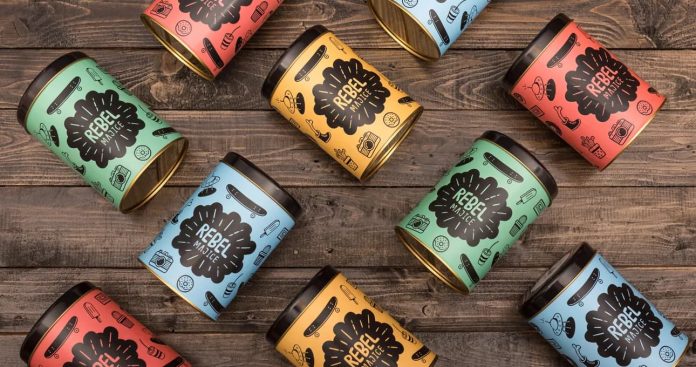
When designing a label, you need to know what information to include, whether it’s for snacks, supplements, or liquor bottle labels. While most labels do not have a lot of information, the type on the label should be large enough to be read. Avoid placing images on the background, since they will detract from the readability of the text.
Table of Contents
Die cuts add visual depth
Die cuts are a creative way to add visual depth to your packaging and label designs. They can be used on single-piece or multi-piece designs. The multi-piece die cut effect is particularly attractive for packaging that consists of multiple layers. This creates visual depth and conveys a message with precision. For example, a die cut design can be used on a sleeve that slides over a primary DVD packaging. The two layers are usually of contrasting colors, allowing the inner color to show through.
Custom die-cut labels use unique shapes to make them stand out from the competition. They can also be used to highlight your logo, brand, or product. Fun shapes can also help your product stand out on store shelves, attracting new buyers. Custom die-cut labels may be more costly, but they can create a distinct look.
In addition to die-cutting, print finishing is another popular way to add decorative effects to your packaging. Intense designs can be achieved using specialty coatings, gold foils, and other creative finishes. Precision die-cutting is another way to use these decorative effects to make your products stand out. Die-cutting is a process that involves the cutting of intricate shapes from the packaging substrate. This technique leaves a crisp edge and provides a clean, polished look.
The process of die-cutting labels is quick and repeatable. Additionally, most die-cut labels can be applied to products easily. While intricate shapes may seem expensive, die-cut labels can be affordable when ordered in large quantities. However, the pricing varies according to the process used to create the die-cut shapes.
Product image or illustration plays a significant role in label design
A strong product image or illustration plays a critical role in label design. Without an image, people would have a difficult time visualizing the product. A good image or illustration would help them differentiate your product from the hundreds of similar products. An image that matches the product’s message is ideal.
A good illustration can help make a product recognizable and can convey information about the product’s origin. Illustrations are especially useful for food and beverage packaging. For example, a label for a fruit juice might feature an exotic animal. In addition to its role in label design, a product’s image or illustration can help create brand loyalty among consumers.
Colors play an important role in label design. Using the right colors and design can help your product stand out from the crowd. Colors can be used to set the tone and create a positive emotional connection with customers. A contrasting color scheme may make a product stand out from the crowd. Moreover, colors can play an important role in buying decisions. You can choose a color to represent your product’s characteristics.
Product name or brand name should have an important spot on the label
The product name or brand name should be the most important aspect of the label, as it is the first thing consumers notice when they see a product. It is also essential to have a consistent look throughout all of your products to ensure your consumers are able to locate your products easily. In addition, the size and shape of your product label will depend on the packaging and container. If your products are in boxes, you may want to separate the front and back labels so that you can put your branding on both sides. Additionally, you can use the shape of the label to draw attention to your product.
A product label should include the name and logo of the company. You can also use a simplified version of your logo, such as a simple logo for small labels. The logo should be in a prominent spot on the label or packaging design, so that your target audience can easily identify what to expect from your product. A product label should also include the amount of the product in the packaging.
The font size should be large enough for the consumer to easily read the information on the label. Otherwise, too much text could make the label look crowded and confusing. Therefore, choose a font size that will show the hierarchy of information. Also, keep in mind that consumers are prone to skimming through labels, so it is important to make the most important information pop out from the page. A striking color or unique text treatment can help attract the attention of the consumer.


