Last Updated on March 12, 2023
Colors aren’t randomly picked when it comes to interior designing. And that’s because they do more than simply make your wall space look pretty. The Correct Color are a universal language capable of evoking and altering various emotions, whether comfortable, calming, intimate or aggressive.
More importantly, the color on your walls backdrops other aspects of interior design, such as lighting, texture, space and layout. And because it’s personal, your color choice can either make or break your attempt to create a style that reflects your home’s personality.
In a world where each color scheme impacts the atmosphere differently, it’s easy to feel lost when choosing the Correct Color for your home. But don’t fret.
This post highlights the key considerations and tips for choosing the correct color palette of your spaces. We’ve also included the psychological effects of different colors so you can arrive at the best and the Correct Color combination for your taste and style.
DIY or Go Pro?
Painting is often easy and fun for most DIYers. But there are times when hiring a professional painter makes more sense. For instance, you’re better off letting a pro handle the task if your walls need some prepping before the actual paint job. Also, if you’re making a drastic color change like transitioning to a brighter color, or the project is likely to take long, going with a professional might be the smarter move. (Mathemania)
You’ll need to consider your duties of care to the worker on your property. Of course, workers on your premises are likely to be covered by their contractor’s insurance package. But note that there are scenarios where you may be held liable for damages under the legal concept of premises liability.
For the most part, a standard HO3 homeowners insurance will cover any injuries that occur on your property. But the extent of coverage varies between providers and depends on your level of involvement in the accident. Check your homeowners insurance policy to understand your personal liability insurance coverage rules and your responsibilities.
Tips for Choosing the Right Color Palette for Your Home Interiors
Each room in your house is a different entity from your kitchen to the bedroom and even the bathroom. That’s to say that every room serves a distinct function by evoking particular emotions, feelings and vibes.
Therefore, the first step when choosing the right color combination for your home is understanding the function of every space and how you want to feel when you’re in it. Doing this is essential for identifying colors and color combinations that match the intended user’s behavior and activities while in that particular room.
Generally, the key considerations to make when matching colors and rooms’ functions are;
- The function of the room
- The size of the room
- Availability of windows for natural light
Read on to discover our suggestion of the best color schemes for these considerations.
Choose Colors Depending on the Room’s Functionality
Best Color Schemes for Living Room
The functions of the living room are three-fold: relaxing, socializing and receiving and entertaining visitors. Whether you prefer a traditional, contemporary or ultra-modern style for your living space, it needs to exude a feeling of coziness, comfort and relaxation. Here are some colors worth considering:
Sage green– this nature-inspired color is trending because it’s subtle and prominent at the same time. It works with various living space design styles and creates a calming and peaceful home vibe while expressing growth.
Blue– the classic blue is a versatile color option because it has a shade for every living room style. Dusty blue shade tends to spark the magic in traditional-style living spaces. Classic blue is relaxing, refreshing and calm, especially when combined with a brighter color like white.
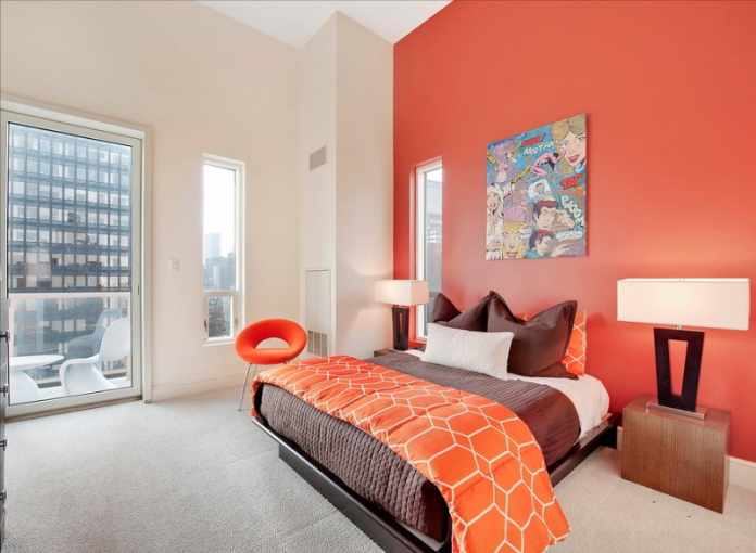
Coral– the uplifting and vibrant vibe of this timeless color makes it a versatile choice for a flattering living space. It emphasizes communication, intimacy, and it’s a reminder to be bold.
Best Color Schemes for Bedroom
Your bedroom needs to have a relaxing and serene environment to provide a soothing retreat after the day’s hustle and bustle. But that tranquility doesn’t have to make the room boring. So, what are the best bedroom color combinations?
Indigo blue and white- blue evokes calmness and relaxation and can help the mind relax. Because it’s slightly warmer than blue, indigo perfectly matches with blue to create a cozy environment with a warm ambiance.
Lavender and off-white– this color combination conveys neutral sophistication by adding freshness to your bedroom without looking too sweet, like pink or aggressive like red or purple.
Bubble gum pink– a great color choice for your fearless daughter. Bubble gum pink is a universal and nostalgic color that works nicely with various shades of green (particularly emerald green, teal and kelly green) and even yellow.
Best Color Schemes for a Small Kitchen
When choosing the best paint color for a small room, you want to go with schemes and color patterns that make the space appear larger than it is. For a small kitchen, the color scheme should be consistent and similar to adjacent areas, so the eyes don’t stop short.
White, off-white combined with natural wood finishes– a perfect combination if you wish to give your small kitchen a big personality and an inviting vibe without being too bold.
Hollingsworth green matchy-matchy– for a tiny kitchen, try matching the color of your cabinets and walls. Hollingsworth green makes your quaint kitchen appear larger while creating a light and airy ambiance.
Turquoise, Goldenrod yellow plus warm wood- turquoise and yellow color palette energizes your kitchen while refreshing your space and making it look wide. Consider a rich wood hue for your lower cabinetry combined with open shelving to create an illusion of more space.
Best Paint Color for Low-Light Areas
When choosing the best colors for dark rooms, consider shades that amplify the little natural light available. Color palettes that increase the sense of space will be a good bet too.
Best Colors for Spaces With Little Natural Light
Pale yellow– its light buttery hues mimic the natural light without overpowering your spaces.
Lavender– thanks to its warmer tones, lavender can easily add brightness to a dark room without being overly feminine. Consider pairing it with pastels if you’re after a more playful style.
Warm orange– this is the perfect hue to add brightness to a sun-deprived room because orange glows radiantly while creating a warmer feel.
Pink– a cheerful pink scheme like pale rose or seashell will instantly cheer your low-light areas without overwhelming them.


